The Art of Pastel: Innovations of Form and Method
By Furio Rinaldi, with Tamia Anaya, Victoria Binder, and Allison Brewer
January 26, 2022
Color into Line: Pastels from the Renaissance to the Present challenges many common assumptions surrounding the use of pastel as a medium. The exhibition attests to both how the medium was applied well beyond the usual sheet paper and how it adapted to ever-changing painting and drawing styles, from the smooth pictorial finishes of the 17th century to the gestural approach of the avant-gardes. Here’s a look at the supports (e.g., paper, parchment), materials, and techniques that have characterized pastel through the centuries.
THE SUPPORTS
BLUE PAPER
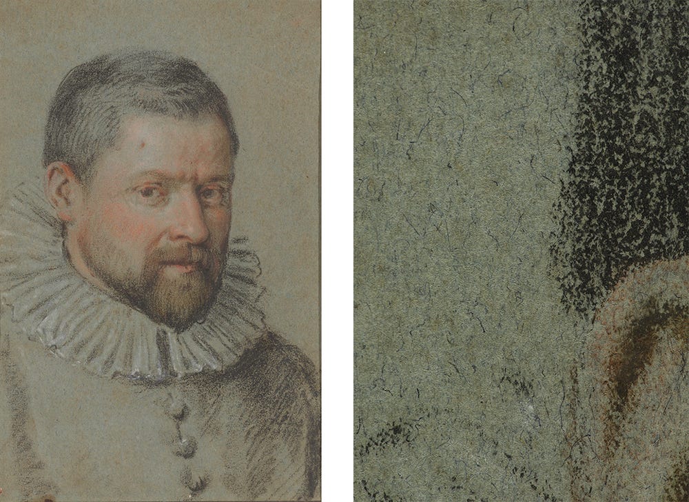
Created using natural dyes, blue paper was popularized by Northern Italian draftsmen in the Renaissance and became a favored support for pastels in the 18th century due to its rugged texture that retains pigments. It was used as a middle ground from which artists could build up chromatic contrasts, highlights, and shadows, as Carlo Caliari (1570–1596), known as Carletto, attempts in his Portrait of a Bearded Man, ca. 1590, using natural black, red, brown, and white chalks. The photomicrograph below shows a flecked blue paper whose hue was likely achieved with indigo, a natural dye with fugitive qualities (meaning it can fade easily when exposed to light). Because of this, it is important to limit the artwork’s exposure to brightness.
(left) Carlo Caliari, Portrait of a Bearded Man, ca. 1590. Black, red, and pink chalks on blue paper, 11 3/4 x 8 in. Fine Arts Museums of San Francisco, Elizabeth Ebert and Arthur W. Barney Fund, 1978.2.21. Photograph by Randy Dodson, courtesy of the Fine Arts Museums of San Francisco. (right) Photomicrograph of the blue paper in Carlo Caliari’s Portrait of a Bearded Man, ca. 1590. Image courtesy of the Department of Paper Conservation, Fine Arts Museums of San Francisco
BROWN PAPER
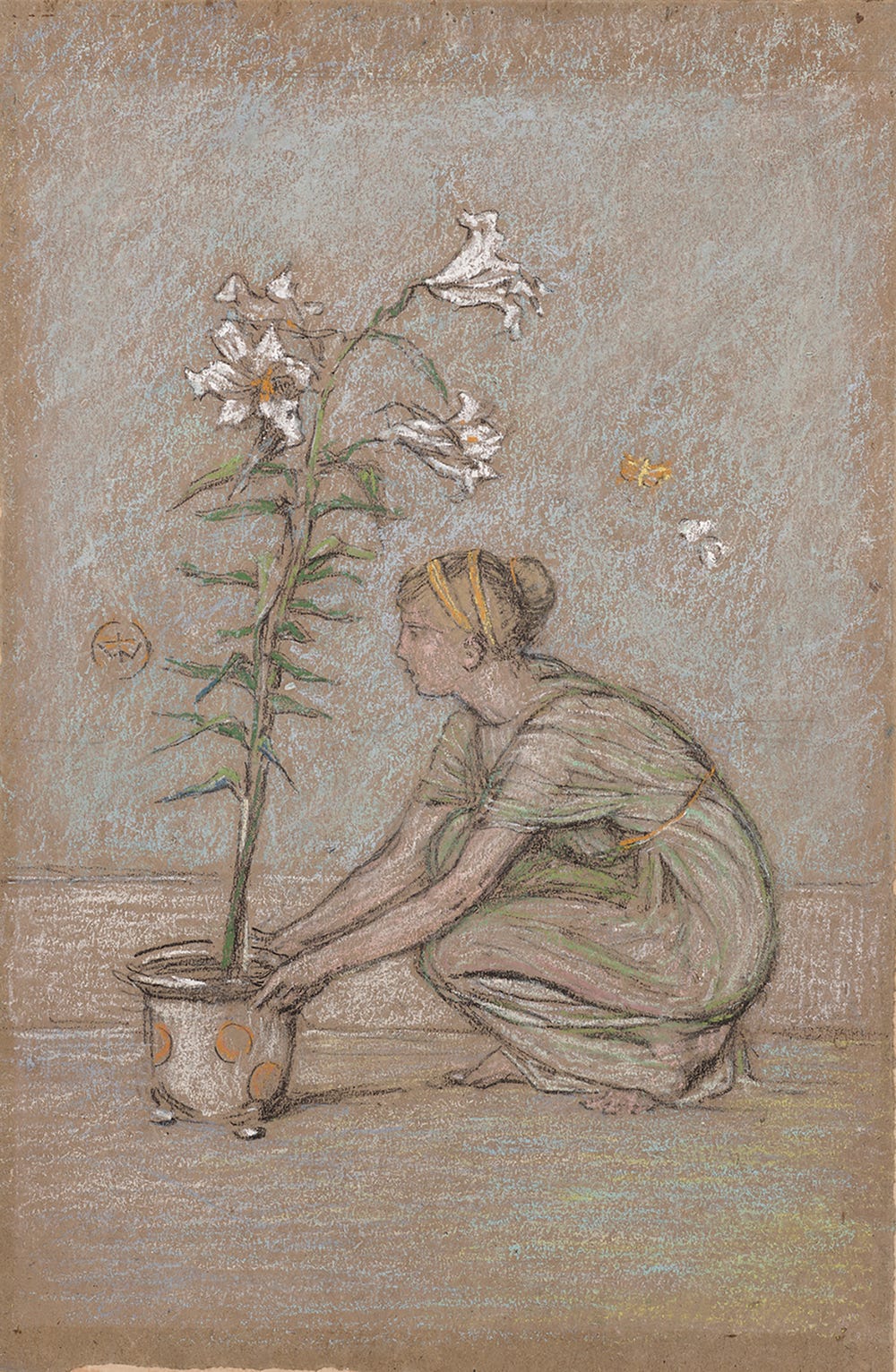
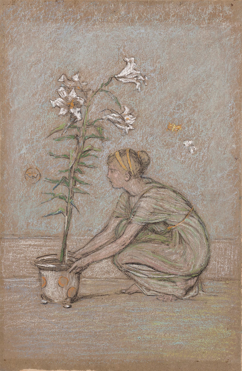
An experimental pastellist, James Abbott McNeill Whistler (1834–1903) tended to favor brown paper, ranging from the finest sheets to low-quality parcel-wrapping paper. The paper’s brown color generally came from raw materials, such as repurposed cotton, linen fibers from rags like sailcloth, and hemp fibers from materials like rope. Whistler composed this image by employing the midtones imparted by the brown paper, rendering the highlights in pastel, and delineating the subject with a black chalk underdrawing. He also relied on the texture of the paper to achieve a soft, grainy effect.
James Abbott McNeill Whistler, The Lily, ca. 1870–1872. Black chalk (or charcoal) and pastel on brown paper, 10 3/16 x 7 in. Fine Arts Museums of San Francisco, Bequest of Whitney Warren Jr. in memory of Mrs. Adolph B. Spreckels, 1988.10.31. Photograph by Randy Dodson
PARCHMENT
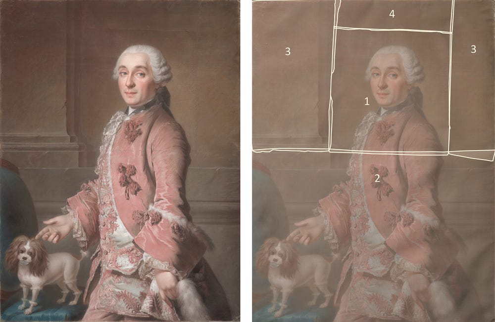
Presented for the first time with an attribution to Jean-Étienne Liotard (1702–1789), the nearly life-size Portrait of a Man and His Dog, ca. 1746–1750, stands out for its sophisticated hatching technique, intricate detail work, and unique parchment support—all elements that suggest this is the work of the great 18th-century Swiss pastellist. Parchment, made from the prepared skin of an animal and used as a durable writing surface since antiquity, was first adopted as a support for pastels by a small group of artists in the 17th century. When treated, its rugged surface is particularly suitable for holding the powdery medium. As parchment sheets were limited in size during the 18th century, Liotard assembled five separate pieces for this work, gluing them together at their edges. He started from the central sheet—on which he blocked the sitter’s facial features—and completed the rest of the composition while piecing the other sheets of parchment around it.
(left) Jean-Étienne Liotard, Portrait of a Man and His Dog, ca. 1746–1750. Pastel over graphite, on five sheets of parchment, mounted on canvas, 44 7/8 x 33 7/8 in (114 x 86 cm). Fine Arts Museums of San Francisco, Gift of Grace Hamilton Kelham and Leila Hamilton Lewis in memory of their mother Grace Spreckels Hamilton, 1965.6. Photograph by Randy Dodson, courtesy of the Fine Arts Museums of San Francisco (right) Graphic reconstruction depicting the parchment pieces used to create Portrait of a Man and His Dog, ca. 1746–1750. Image: Allison Brewer, Department of Paper Conservation, Fine Arts Museums of San Francisco
THE MATERIALS
GREEN PASTEL
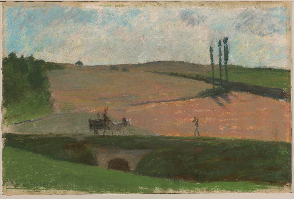
The employment of pastel in genres other than portraiture—such as landscape and still life—was greatly limited by artists’ difficulty obtaining a stable shade of green. When finally formulated and introduced in the late 18th century, the green pastel initiated a new chapter of aesthetic possibilities, allowing artists to more authentically depict their natural surroundings. Artists drawing en plein air generated a demand for pigments that replicated nature’s colors, particularly green. In his works, Camille Pissarro (1830–1903) used two popular greens—emerald green and viridian. Emerald green, with its vibrant blue-green hue, is a poisonous, arsenic-based pigment that first became commercially available in 1814. It was wildly popular, despite its toxicity and chemical instability. Viridian, which Pissarro used here, is a chromium oxide dihydrate first manufactured in 1859. It was quickly adopted by artists and industries for its stability and low toxicity.
Camille Pissarro, The Road to Ennery, 1874. Oil pastel on paper, 9 7/8 x 14 3/4 in (25.1 x 37.5 cm). Deborah and Joseph Goldyne. Photograph by Randy Dodson, courtesy of the Fine Arts Museums of San Francisco
OIL PASTEL
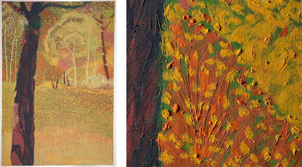
Twentieth-century technological advancements in the petroleum industry enabled the manufacture of different types of wax-based drawing media, including oil pastels. With the addition of oil and wax to traditional pastel ingredients, the medium could be formed into sticks that delivered highly saturated colors. In Central Park #1, 1984, Joseph DiGiorgio (1931–2000) employed a range of techniques, from blending to scratching, that took advantage of this formulation. The pastel’s buttery quality allowed the artist to build up a large network of small and deliberate marks.
(left) Joseph diGiorgio, Central Park #1, 1984. Oil pastel on paper, 44 5/16 x 60 1/4 in. Fine Arts Museums of San Francisco, Gift of Mrs. Helen Dilello and John Dilello, 2002.160.2a. © Joseph di Giorgio. Photograph by Randy Dodson (right) Detail of Joseph DiGiorgio's Central Park #1, 1984. © Joseph di Giorgio. Photograph by Randy Dodson. Department of Paper Conservation, Fine Arts Museums of San Francisco
SOFT PASTEL
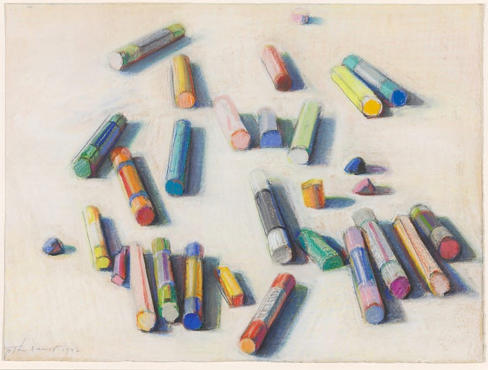
In the beguiling trompe l’oeil Various Pastels (Pastel Scatter), 1972, Wayne Thiebaud (1920–2021) depicted the pastels he used in the work—manufactured cylindrical sticks of soft pastel—infusing his subject with the same chalky consistency as the drawing’s medium. The basic ingredients of soft pastels are typically ground pigments and a water-based binder (such as gum tragacanth or gum arabic), which together form a paste that can be pressed into sticks. Paler tones are achieved by adding a white filler pigment, such as chalk or gypsum. A high percentage of pigment gives this type of pastel its soft, velvety character.
Wayne Thiebaud, Various Pastels (Pastel Scatter), 1972. Pastel on paper, 10 1/2 x 14 in (26.6 x 35.5 cm). Private Collection. © 2021 Wayne Thiebaud / Licensed by VAGA at Artists Rights Society (ARS), NY. Photograph by Randy Dodson, courtesy of the Fine Arts Museums of San Francisco
THE TECHNIQUES
WET PASTEL
Rosalba Carriera (1671–1757) achieved a painterly effect through combining wet and dry applications. By mixing a ground pastel into a wet vehicle, she was able to create a thick paste, which she applied with a brush in fluid and textured strokes. Innovative in her technique, Carriera was the first artist to soften figures with stumping—dragging the flat side of her chalk lightly over a contrasting color. This method is particularly effective for depicting diaphanous (delicate) materials, such as a light complexion.
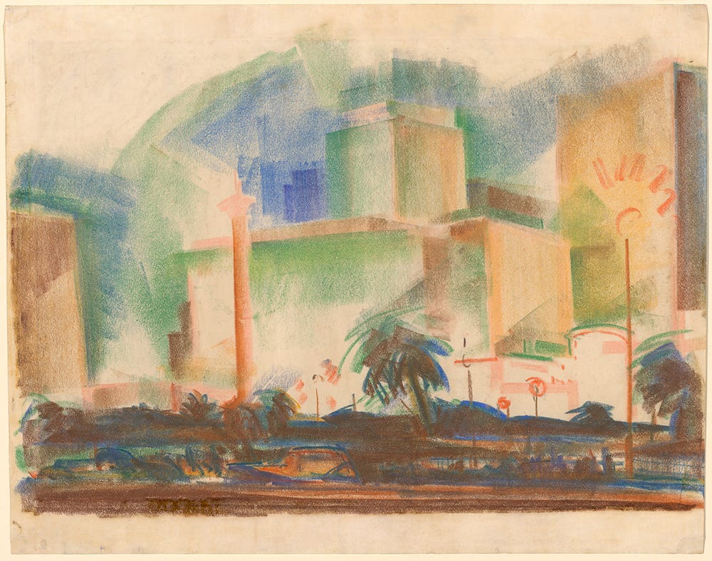
William Larkins, Union Square, San Francisco, ca. 1930. Oil pastel and traces of graphite on paper, 18 13/16 x 23 15/16 in. Fine Arts Museums of San Francisco, Gift of Frederick Mulder, 1990.2.1. Artwork © William Larkins. Photograph by Randy Dodson, courtesy of the Fine Arts Museums of San Francisco
SIDESTROKE
In his Art Deco depiction of San Francisco’s Union Square, William Larkins (1901–1974) employed a sidestroke drawing technique. By blocking in general areas of color using primarily the long side of the pastel, he was able to quickly capture the energetic city center. The artist’s capacity to create dynamic sidestrokes was enhanced by his use of a very smooth and thin sheet of paper, rather than the textured paper traditionally used for pastels.
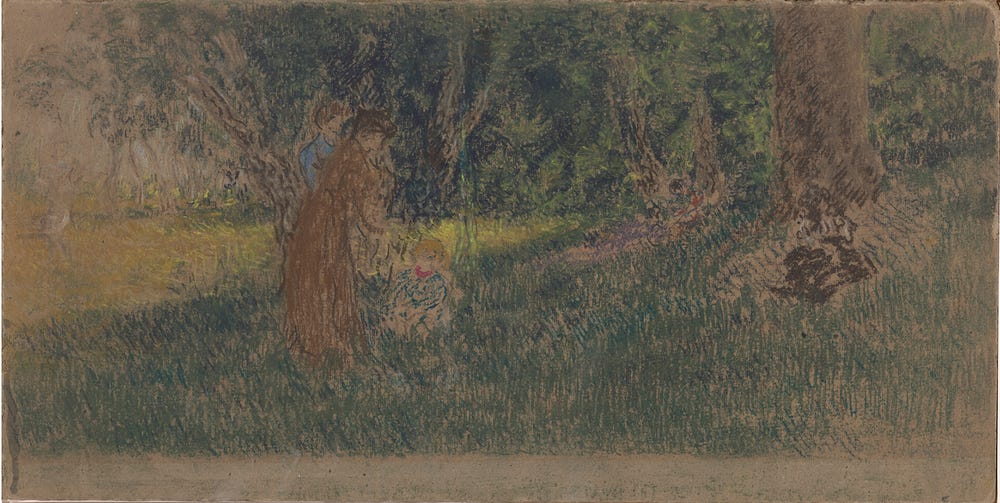
Ker Xavier Roussel, Au Jardin, ca. 1890. Pastel, 8 7/8 x 19 1/2 in. Gift of Mr. and Mrs. Richard Lockwood Tower, 1977.2.3. Photograph by Randy Dodson
FEATHERING
Ker Xavier Roussel (1867–1944) achieved an extreme linear quality in his work through a technique called feathering, which involves building up areas using light and quick strokes of pastel in a consistent direction. Instead of blending the strokes together, Roussel overlaid colors to build the scene and modify the hues—a technique comparable to those used in paintings by Divisionists such as Georges Seurat (1859–1891).
Text by Furio Rinaldi, curator of drawings and prints, Achenbach Foundation for Graphics Arts, with Tamia Anaya, Mellon Fellow in paper conservation, Victoria Binder, head of paper conservation, and Allison Brewer, assistant paper conservator, at the Fine Arts Museums of San Francisco.
Color into Line: Pastels from the Renaissance to the Present is on view at the Legion of Honor from October 9, 2021 through February 13, 2022.
