The Fine Arts Museums of San Francisco’s extensive and diverse pastel collection is the subject of the exhibition Color into Line: Pastels from the Renaissance to the Present, on view at the Legion of Honor from October 9, 2021 until February 13, 2022.
Composition
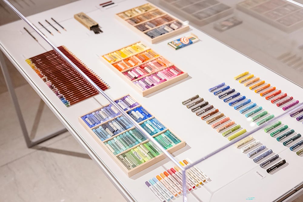
Pastel is almost pure color, composed of three elements: finely ground pigments, a dry filler (kaolin, chalk, or plaster), and a binder (traditionally a vegetable gum, such as gum arabic). When mixed with water, these elements form a “little paste” (pastello). This paste is then rolled into a cylindrical stick (the crayon) and dried. The filler gives substance to the stick, facilitating the transfer of pigment to the support, which is usually paper. There are different types of pastels. Hard pastels contain more filler and are best suited for lines, detail work, and finishing touches, while softer pastels are better at providing coverage and a velvety, pictorial finish. The concentration of the filler determines the pigment’s opacity: light hues (whites, pearl grays, pinks) are compounded with greater proportions of filler. A smaller amount of filler is used for darker and deeper tones (lampblack, Prussian blue, and indigo).
This formulation has remained nearly unchanged for five centuries, from the sixteenth century to the present day, ensuring that the seductive medium continues to deliver the appearance of a painting, the immediacy of a drawing, and the timeless matte finish of a fresco.
A display of pastels from the exhibition Color into Line. Photography by Gary Sexton
Hues + techniques
When pastel first emerged in Renaissance Italy, the shades of colors were obtained from natural friable (easily crumbled) chalks—clay-based minerals mined from the earth and used for drawing after minor manipulations. By grinding the chalks and mixing them together into fabricated colored sticks, artists from this period were able to obtain previously unavailable shades, which they used to infuse their preparatory drawings with a higher sense of naturalism.
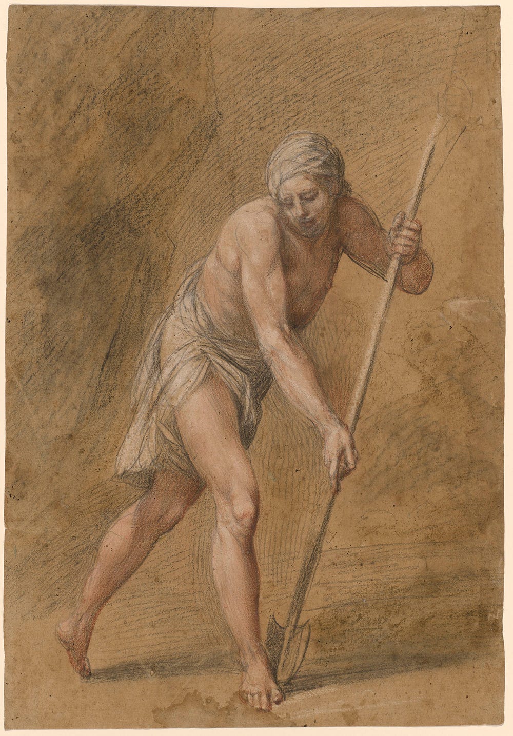
For example, in the 1590s, Italian artist Giuseppe Cesari blended white and red chalks to create the peach pink that he introduced in his drawings to convey the light flesh tones of his models. His study of a man with a spade (below) is a preparatory study for a figure frescoed in the large scene of the Foundation of Rome in the city’s Conservators’ Palace.
Giuseppe Cesari, Cavaliere d’Arpino, Man with a Spade, ca. 1638. Red, pink, and white chalks over black chalk on paper, 14 15/16 × 10 5/16 in. (37.9 × 26.2 cm). Fine Arts Museums of San Francisco, Achenbach Foundation for Graphic Arts, 1963.24.167
One color remained elusive: green. The absence of green limited the range of possible subjects, such as landscapes and still-life, available to artists. Green pastel was not introduced to the market until the late eighteenth century, when pastel makers attempted to fabricate the hue, unavailable in nature, by mixing yellow and blue pigments, but the combination proved to be highly unstable and unsatisfactory.
In the early nineteenth century, artists drawing en plein air generated a demand for pigments that replicated nature’s colors, particularly green. Two greens were especially popular: emerald green and viridian. Emerald green, with its vibrant blue-green hue, is a poisonous, arsenic-based pigment that first became commercially available in 1814. It was wildly popular, despite its toxicity and chemical instability. Viridian is a chromium oxide dehydrate that was first manufactured in 1859. It was quickly adopted by artists and industries for its stability and low toxicity.
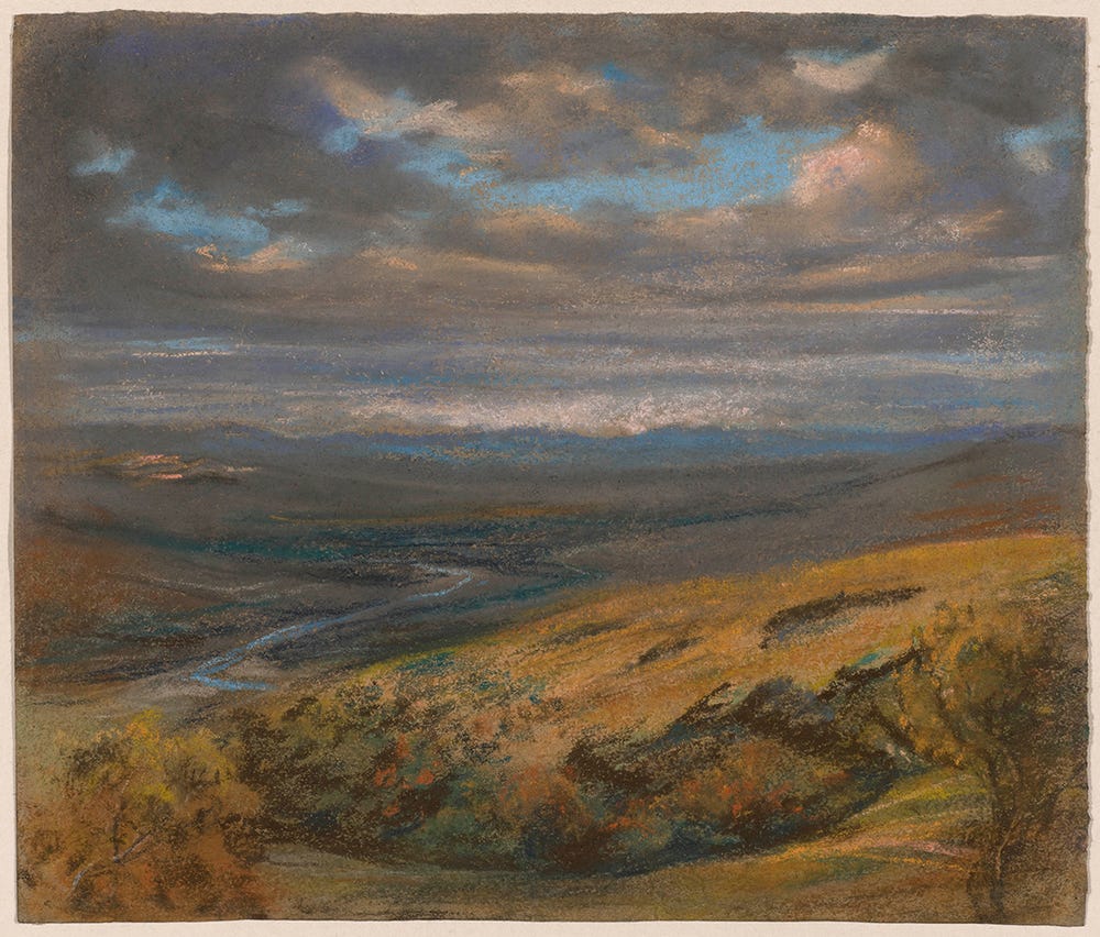
Elisabeth Louise Vigée-LeBrun, A Hilly Landscape with a River, ca. 1820. Pastel on paper, 9 1/16 x 10 13/16 in. (23 x 27.5 cm.). Fine Arts Museums of San Francisco, Museum purchase, Achenbach Foundation for Graphic Arts
Among the first artists to use green pastel and to apply it to the genre of landscape was Elisabeth Louise Vigée-LeBrun, famed and known throughout Europe mostly for her brilliant oil portraits. Returning to France from her travels to Switzerland in 1808, the artist brought with her “about two hundred pastel landscapes,” by her own count. Only about fifteen of these survive today. Recently acquired by the Museums, A Hilly Landscape with a River (above) is a rare testament to Vigée-LeBrun’s seminal role as a landscape artist. In taking up her pastels to immortalize a landscape, the artist inaugurated a practice that had a bright future, and a growing usage: From the 1830s onward, pastel gradually overtook the popularity of watercolor and oils to portray a landscape, because they were easy to handle and transport, making them well suited for excursions.
By the end of the seventeenth century, approximately sixty-five different pigments were available to artists in Europe, with hundreds of gradations being produced from combinations of fillers. Master pastellists, like the eighteenth-century British artist Francis Cotes and the French impressionist Edgar Degas, did not just supervise the preparation of crayons but also made their own, engaging in a demanding process that required extensive knowledge of chemistry.
The process for making the crayons was laborious. Since pastels, unlike oil paints or watercolors, cannot be mixed to produce new tones, and lose their brilliance when compressed, artists must prepare all of their colors in advance. Color variations are achieved through juxtaposition and layering: Once applied, pastel can be manipulated, rubbed, softened, and blended with a variety of tools, including chamois, stumps, tortillions, and even brushes, if the pastel is moistened or pulverized.
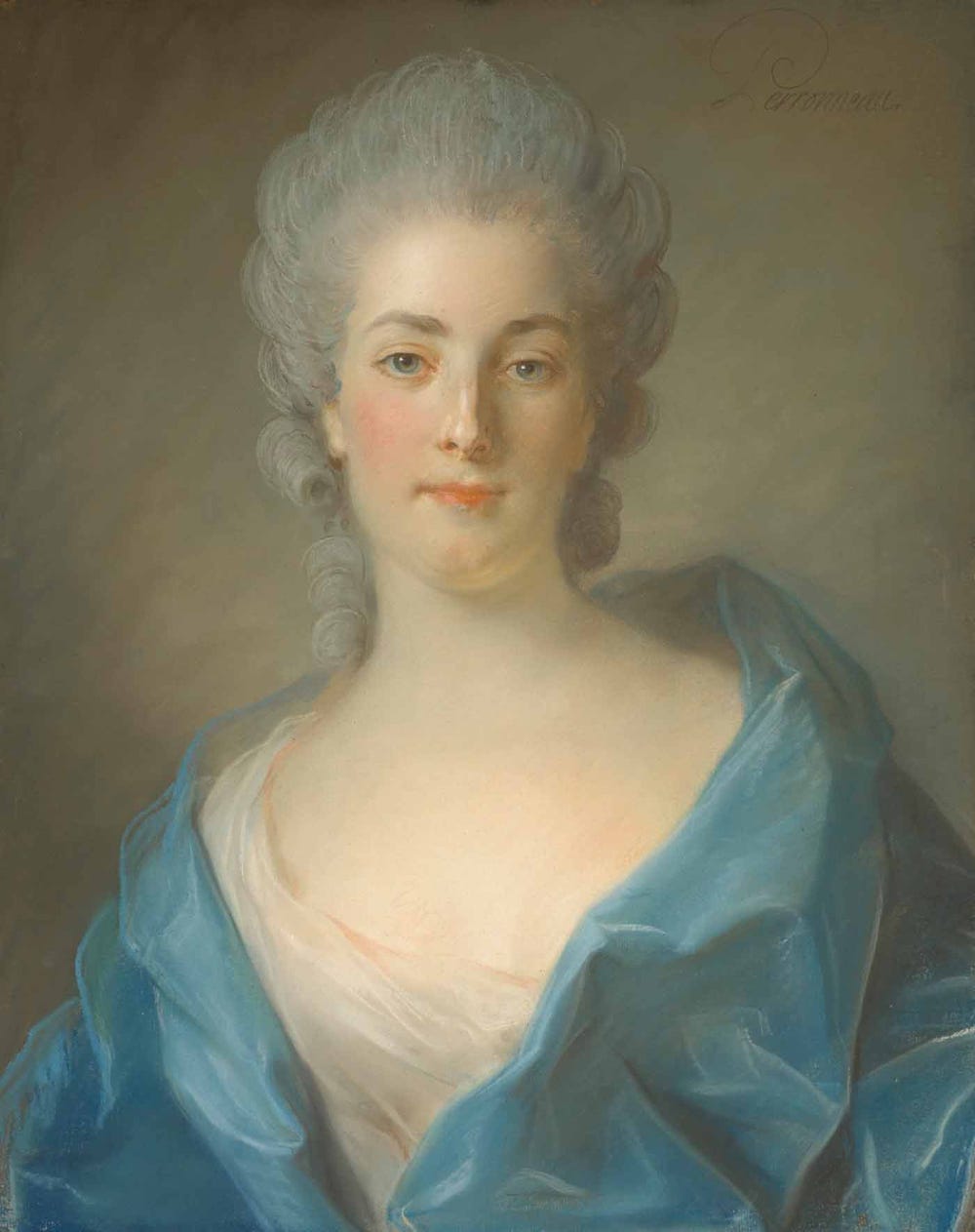
By using highly controlled layering, and manipulating the pastel strokes, Jean-Baptiste Perroneau conveyed the translucent glow of the sitter’s skin and the ethereal quality of her hair in his portrait of a woman (below), engaging the viewer in a sensual, nearly tactile experience of the sitter’s presence.
Jean-Baptiste Perroneau, Portrait of a Woman (Traditionally identified as Marie-Reine Petit de Laburthe, Marquise d’Anglure), ca. 1781–1783. Pastel on paper, mounted on canvas, 24 3/16 x 19 in. (61.5 x 48.2 cm). Fine Arts Museums of San Francisco, Achenbach Foundation for Graphic Arts, Gift from the Collection of Mr. and Mrs. John Jay Ide, 1996.88
Supports
Sixteenth-century Northern Italian draftsmen favored using a porous blue laid paper as a support, characterized by a cool tone that enhanced highlights and contrast. With a ribbed texture that retained the pigmented particles and helped hold them in place, blue paper became the preferred support of artists in Europe through the eighteenth century, who often laid it on canvas that they attached to a wood strainer for more stability.
Until the introduction of wove paper in 1756, supports varied in quality. They generally had to be strong enough to resist the treatment used to produce the necessary surface texture needed to retain the powders. Beginning in the late eighteenth century, artists also experimented with a number of unusual supports—from commercially primed canvas to silk to sheets of parchment, which were often pieced together, as large formats of these materials were unavailable. In addition to not retaining pigments, these supports required the application of fixatives for stabilization, liquid solutions that ultimately dulled the colors’ brilliance.
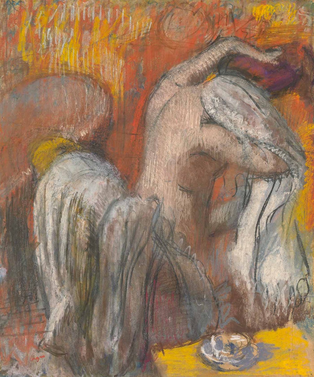
Edgar Degas, Seated Bather Drying Her Neck (Femme s’essuyant), ca. 1905–1910. Charcoal and pastel on two joined sheets of tracing paper, laid down on board, 27 1/16 x 22 7/8 in. (68.7 x 58.1 cm). Fine Arts Museums of San Francisco, Achenbach Foundation for Graphic Arts, Gift of Mrs. John Jay Ide, 1995.62
Degas’s layered design process, and his choice of supports (from monotypes to silk and tracing paper), which were mostly unfriendly to pastels, made fixatives essential. However, part of the artist’s genius was to turn this requirement into something constructive, treating the material as one more component of his design process. In the tapestry of materials used in Degas’s Seated Bather Drying Her Neck (Femme s’essuyant) (above), one of his great, late pastels of ca. 1910, he fixed the charcoal underdrawing, legible under infrared, to the successive layers of pastels between applications. This allowed him to rework the composition from the surface and build up a complex structure that enhanced both the drawing’s physical density and its brilliance.
Text by Furio Rinaldi, Curator, Achenbach Foundation for Graphics Arts at the Fine Arts Museums of San Francisco.
Color into Line: Pastels from the Renaissance to the Present is on view at the Legion of Honor from October 9, 2021 until February 13, 2022.
Header image: Wayne Thiebaud, "Various Pastels (Pastel Scatter)", 1972. Pastel on paper, 10 1/2 x 14 in. (26.6 x 35.5 cm). Private Collection. © 2021 Wayne Thiebaud / Licensed by VAGA at Artists Rights Society (ARS), NY.
