Several months ago, Linda Butler (Director of Marketing, Communications, and Visitor Experience at the Fine Arts Museums of San Francisco) and Jennifer Sonderby (Sonderby Design) were entrusted by former Director and CEO of the Museums Max Hollein with the responsibility of refreshing the institution’s brand identity. Having recently worked together on a rebranding assignment at the San Francisco Museum of Modern Art, they understood both the importance of this task and its potential. To work successfully, the approach required close collaboration with internal teams.
Defining a brand is not only important for external purposes but also has impact across every area within an organization. So it was essential to engage all departments and to partner with a design expert whose philosophy aligned with this inclusive and collaborative approach.
For an institution to deliver on its promise to serve the public with maximum impact, it is critical that its identity is clear and distinct. A strong brand allows us to rise above the surrounding noise, communicate clearly the values of the institution and the diversity of our offerings, and powerfully articulate our purpose.
At the start of this process, Butler and Sonderby understood that although recognition of the de Young and Legion of Honor individually is high, very few current and potential visitors understand that the two museums are connected under a joint operating agreement as the Fine Arts Museums of San Francisco. They identified an opportunity to better communicate this association, as well as the combined breadth of our collections and programs, to our audiences. Our strategy was to capitalize on the strengths of our current brand as we embarked upon a three-part “refresh” project that included development of a messaging platform, refinements to the visual identity, and improvements to the wayfinding signage.
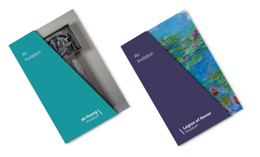
The concept for the visual identity introduces a slash between the two names, serving as a visual anchor that graphically connects the two museums. Read visually, the slanted line highlights different points of view, inviting viewers to consider a new angle on art and the world.—Jennifer Sonderby
The project began by working across the institution to solidify a unified messaging strategy that reflected the Museums’ vision, values, and purpose: to provide places of respite and inspiration that warmly welcome people of all backgrounds, connecting them to one another and to a world of art and ideas. Through this process, Butler and Sonderby affirmed that the two museums together, with their shared collection, provide a deeper, more satisfying, more diverse experience than the two individual museums provide alone. The de Young and the Legion of Honor together offer contrasts, connections, discovery, and the opportunity to see the world in fresh ways. The element of connection—between art, people, and ideas—is essential to the institution’s identity.
It was through this lens that the recent updates to the visual identity were approached. But first, it’s helpful to understand the history of the institution’s logos. When the new de Young building opened in 2005, a new identity was also introduced. This logo, which included detailed illustrations, lacked the scalability necessary to cover the new communication needs of the institution. Over time, the illustration elements were dropped, leaving only the logo’s text components. But these weren’t suitable for all needs. Amy Browne, director of graphic design, noted, “The simplified versions of the logos did not have proper usage restrictions, which caused many disparate variations to spawn in response to the institution’s diverse needs.”
For example, the simplified versions of the logos did not solve the biggest challenge, which was to provide graphically distinct marks that functioned in outdoor settings (such as banners and bus ads). The logos were often confused as text. This was particularly problematic for tourists and other potential visitors unfamiliar with the names “de Young” and “Legion of Honor,” which do not clearly identify these as art museums.
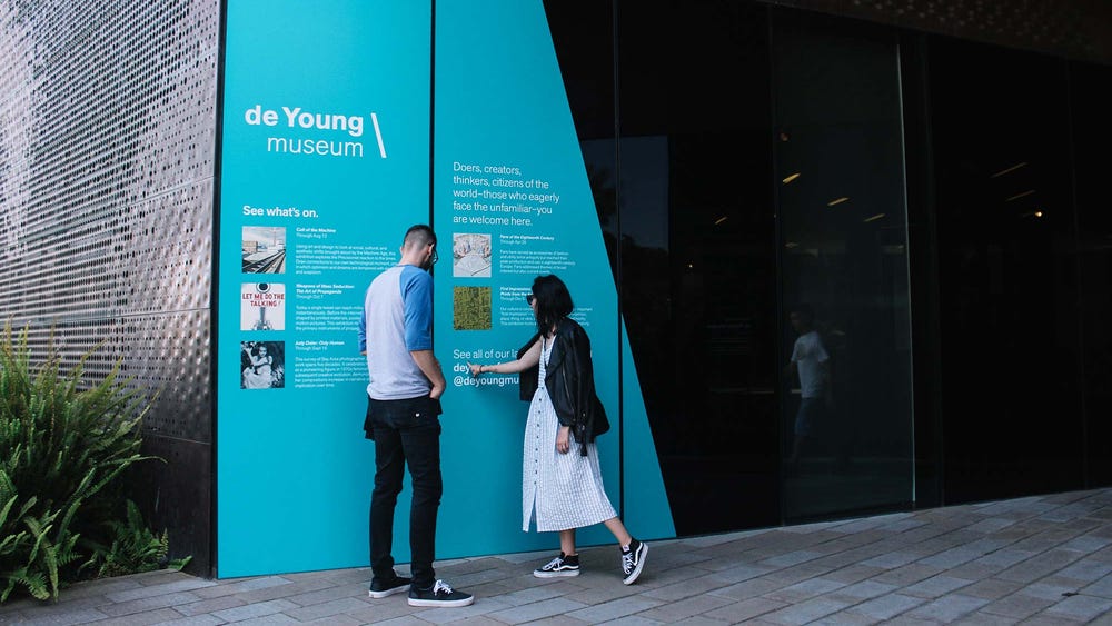
The refreshed identity introduces changes to the individual museum logos, the color palette and a graphic approach designed to highlight the breadth of the collection.
The identity refresh was designed to eliminate this confusion. The logos build on the institution’s signature typeface, Akzidenz-Grotesk, while providing a graphic anchor that distinguishes the marks as logos, and not text.
The angle/slash provides a connective thread between the two museums while allowing the identity of each museum to take center stage. Although the logos for the two museums share visual attributes, they are differentiated by separate color schemes—the de Young’s cerulean blue is inspired by the patina of aging copper, while the Legion of Honor’s amethyst reflects its stately presence.
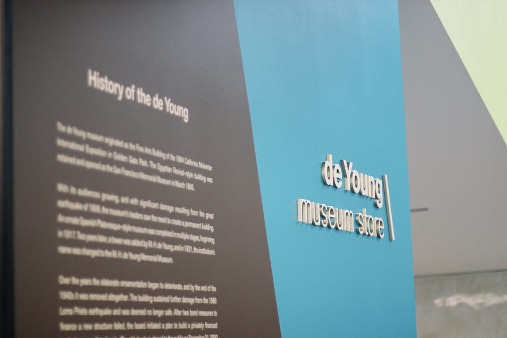
New signage at the de Young Museum Store
The Museums' goal is to extend the values of the institution into every aspect of the experience. For this reason, not only is the brand being updated but also the wayfinding signage at museum entrances and public spaces, welcoming diverse audiences in multiple languages. Be on the lookout over the coming months as these and other exciting changes take shape within the de Young and Legion of Honor and the Museums’ communications throughout the city.
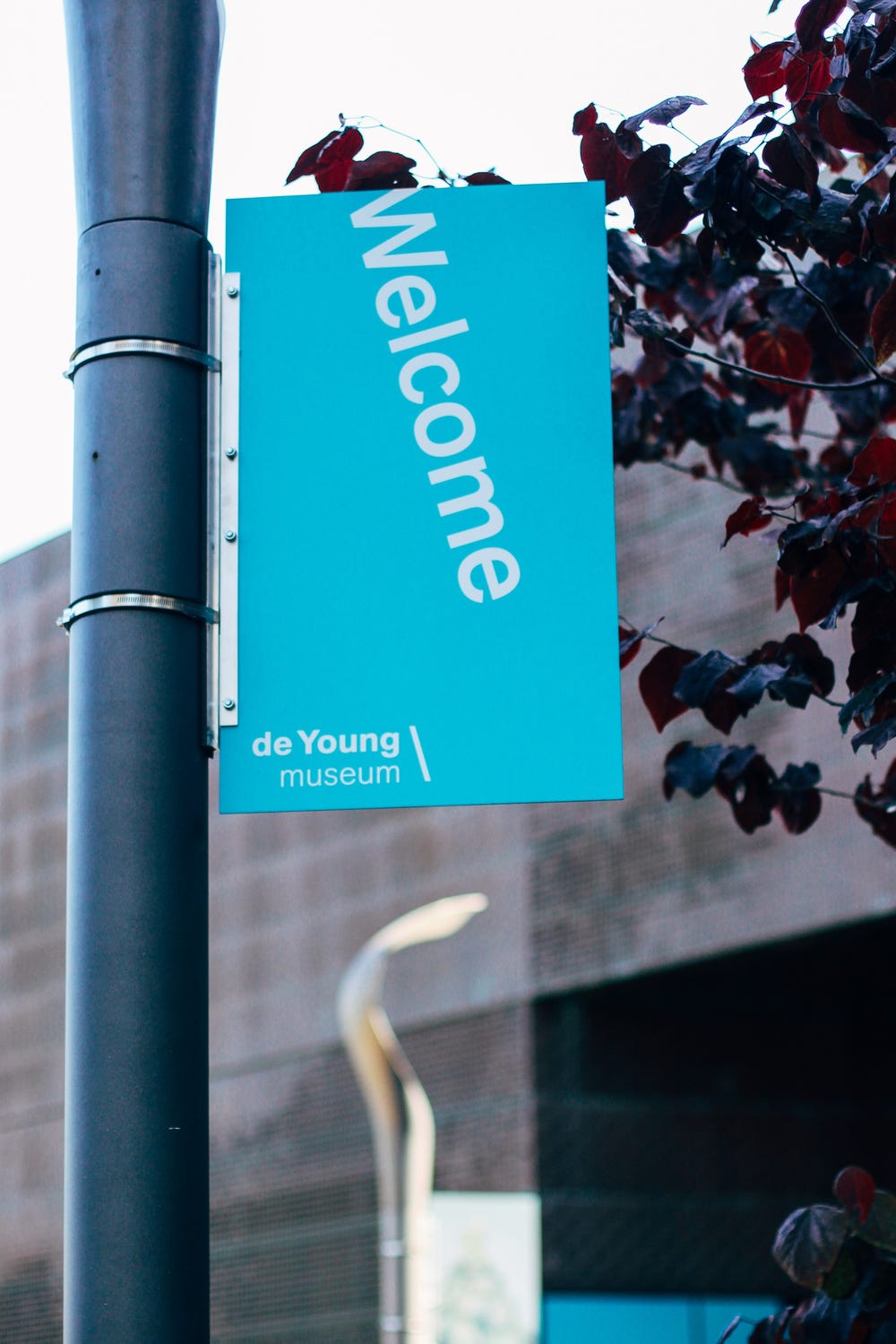
Banners welcome visitors outside the entrances to the de Young.
Linda Butler
Director of Marketing, Communications, and Visitor Experience
Jennifer Sonderby
Sonderby Design
Linda Butler and Jennifer Sonderby were assisted in this project by Amy Browne, director of graphic design at the Fine Arts Museums of San Francisco; Apollonia Morrill; and Brad Thomas at Graphic User, LLC.
